I never watched Lost in Space, but it had a couple of awesome themes. I really like the Season 3 opening:
I thought it would be fun to remake it new people, but I didn’t want to hand-draw the titles to match the style of the original text. I looked for a font that was close enough to fake it, but I didn’t find anything I liked. So I did the only sensible thing: I made my own font.
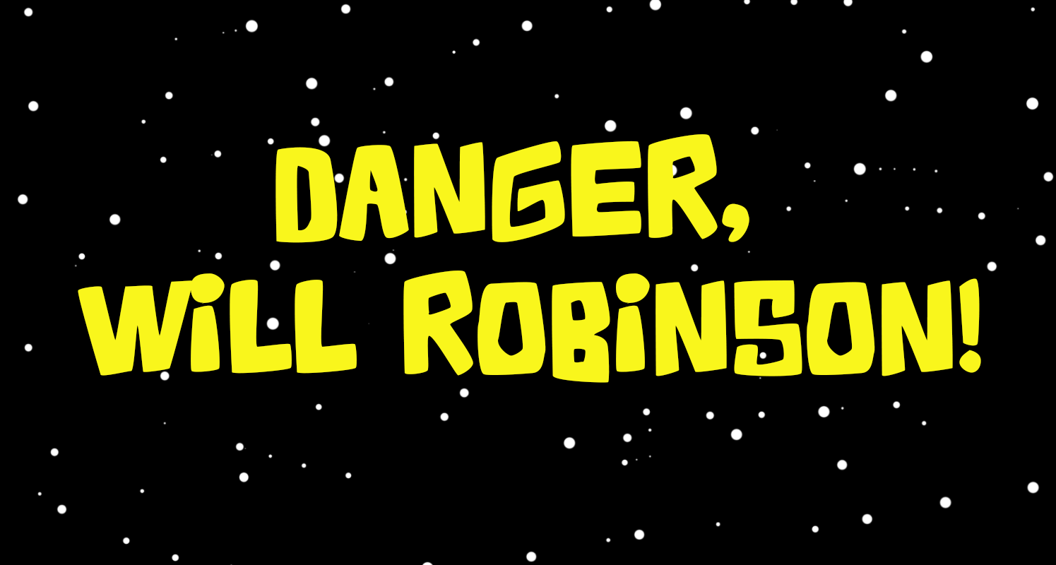
As I was making it I realized it still wasn’t quite right, but I liked it enough to “finish” it. It’s not a complete font. It’s all caps (except that pesky lowercase i), and it has numbers and a lot of common symbols and punctuation, but nothing fancy. I’m still going to use it.
I also thought I’d share it. It’s free, and a bargain at twice the price!
Here’s a link: https://drive.google.com/file/d/1lJKaHvULJaeV2gtltI6PDWTo42dLdAGU/view?usp=sharing
Leave a Reply