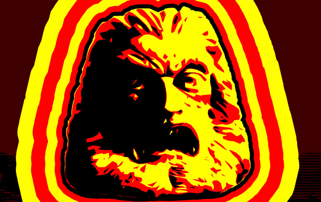
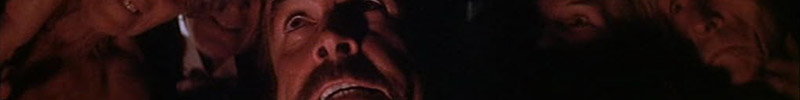
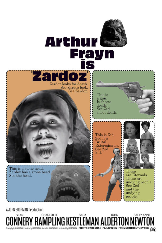
I’ve been meaning to watch this for decades, but never got around to it until The Flop House did it on Flop TV. It takes itself very seriously, which is impressive for a movie that features a hairy Scottish guy in a red diaper. But I didn’t hate it!
Today’s fake poster is a really strong copy of the poster for Harper. Too bad pretty much no one (including me) remembers seeing the original. I like that it looks like the movie is about some guy with a drawn-on goatee.
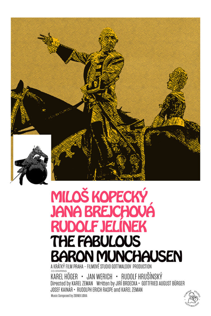
I like this eighty times more than Terry Gilliam’s movie. It’s easily my favorite Czech fantasy story based on a German story about the fictionalized adventures of a real human.
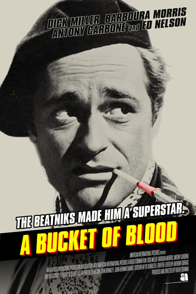
I had to look up how I used to do fake cross-hatching for this poster. It’s not quite right, but I did it last night when I should have been sleeping so I’m calling it good enough.
Today’s fake poster comes from a different movie about people going on crazy adventures.
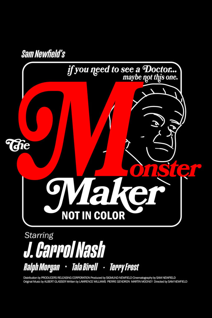
My friend’s grandfather, Terry Frost, was a character actor who appeared in hundreds of movies from the forties to the sixties. Letterboxd only lists 89, but I’m guessing many of his parts were uncredited. I’d never seen any of his movies. Most of his movies were westerns, but this sci-fi horror flick had the largest part of his that I could find to watch, so I went with it.
It’s exactly what you’d expect from a 40s science fiction b-movie. Low budget, short, full of nonsense science, wild coincidences, and a laboratory with a gorilla for no reason other than mad scientist’s labs are supposed to have gorillas. A perfectly acceptable excuse to sit in the dark and eat popcorn.
Today’s fake poster is the third one I’ve done based on a movie from the seventies’ “classy porn” period. The others are here and here. I picked it mainly because there are very few decent quality images available from this movie. But I did learn how to load alternate characters from a font into Photoshop. I was afraid I’d have to draw them in manually.
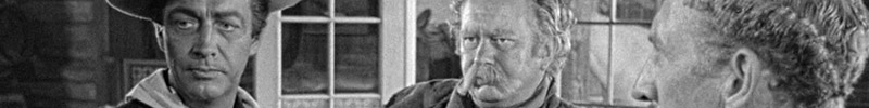
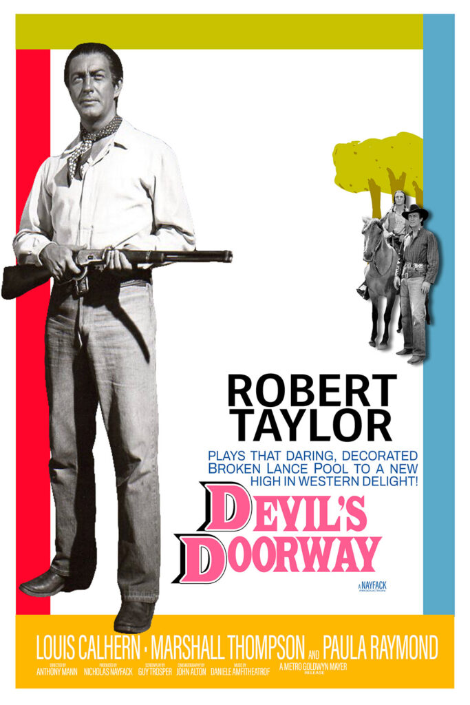
While it’s pretty impressive that this 75 year old movie says “hey, the USA did handle indigenous populations correctly,” it’s also a movie with a very white lead actor in full on red face.
Also: it’s certainly not the fault of the movie, but it is weird that the subtitles for a film about people being forcibly ejected from their land choose to show all the Shoshone dialogue as “SPEAKING FOREIGN LANGUAGE.”
Another thing that’s not the fault of the movie: Every time I hear “Devil’s Doorway” I think of Satan’s Alley.
Robert Taylor (1500 Vine Street) looks plain silly in his dark makeup and light eyes, but his actual performance isn’t as stereotypical as you might expect.
If your whodunit only has one reasonable suspect, it’s not much of a whodunit. Even the characters in the movie know it’s a flimsy story; the lead detective’s method to sole the crime is pretty much “I’ll stand near that guy until he screws up.”
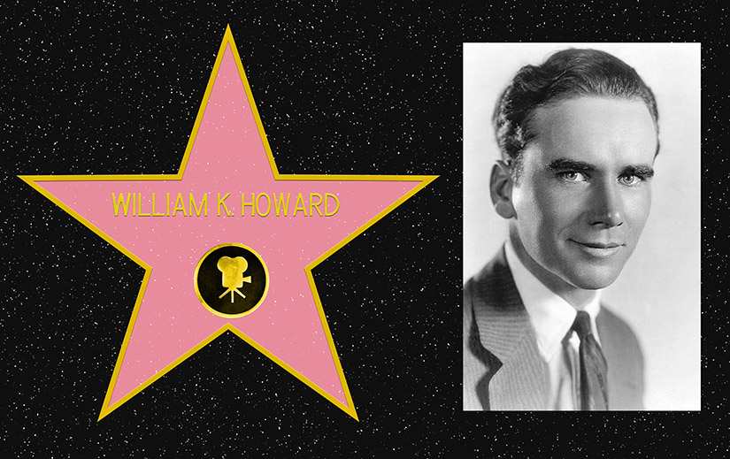
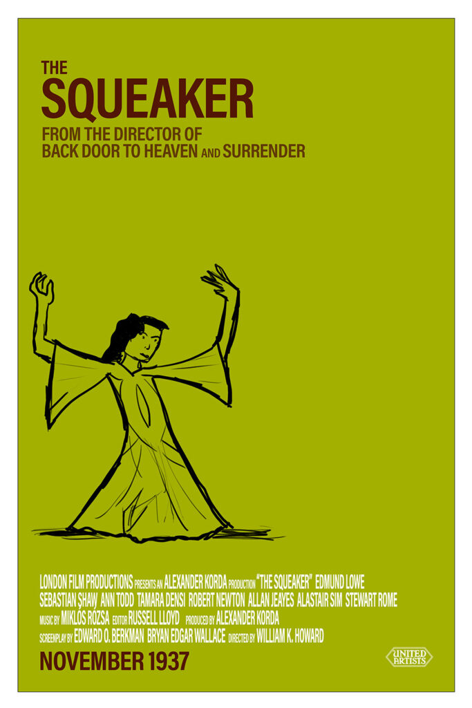
William K. Howard (1500 Vine Street) directed over 50 movies, and at his peak was considered a leading director. Not that you can tell that from this movie. ZING!
Today’s fake poster might make you think of merlot.
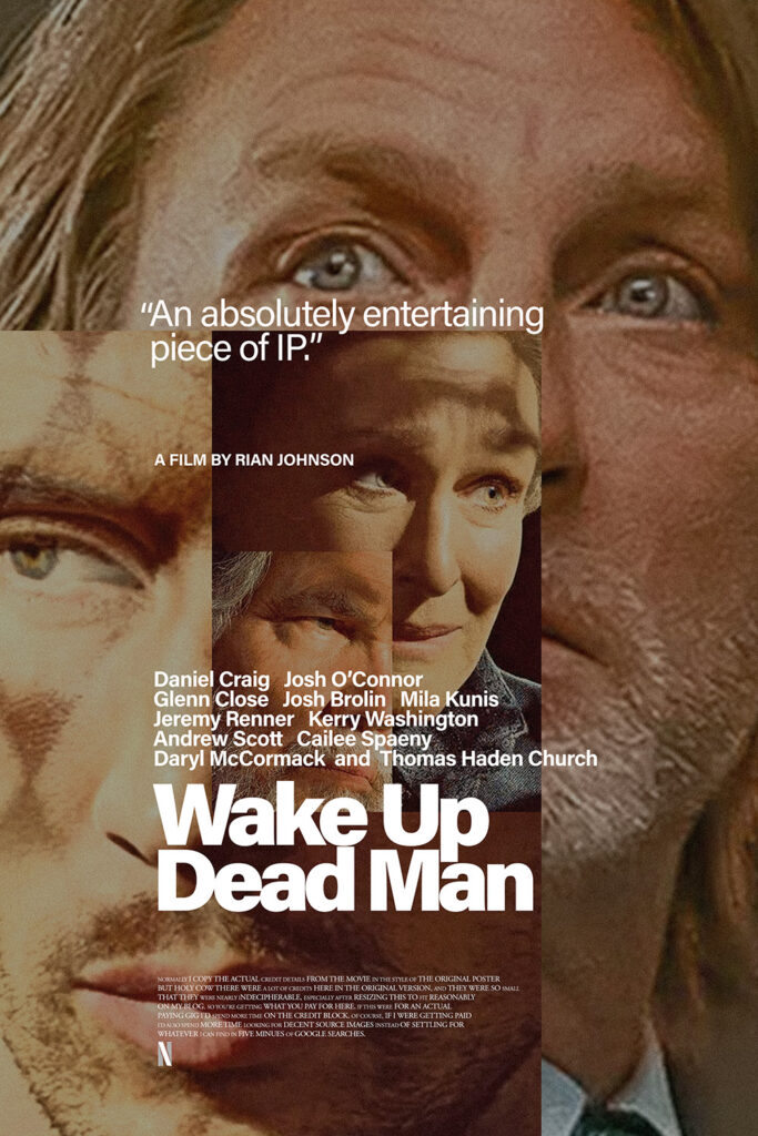
The Knives Out movies are fun. The murder mystery is always there, but they never have the same theme. The first was about family, the second about unchecked wealth, and this one about faith. And they mostly play fair- we get all the clues at the same time as Benoit Blanc. I hope they make a hundred more of them.
The inspiration for today’s poster is a movie that I saw a long time ago: two days before this one.
I had to add some text lines to fit in more cast members.
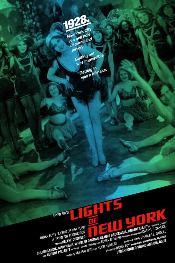
Lights of New York is the first “all-talking” picture. Other movies had synchronized sections, but this is the first one that synchronized the whole movie. It’s a pretty terrible movie, but that’s no surprise. Most of the effort probably went into capturing sound, and it was probably very expensive to do multiple takes or camera angles; it’s full of stiff, unbroken scenes.
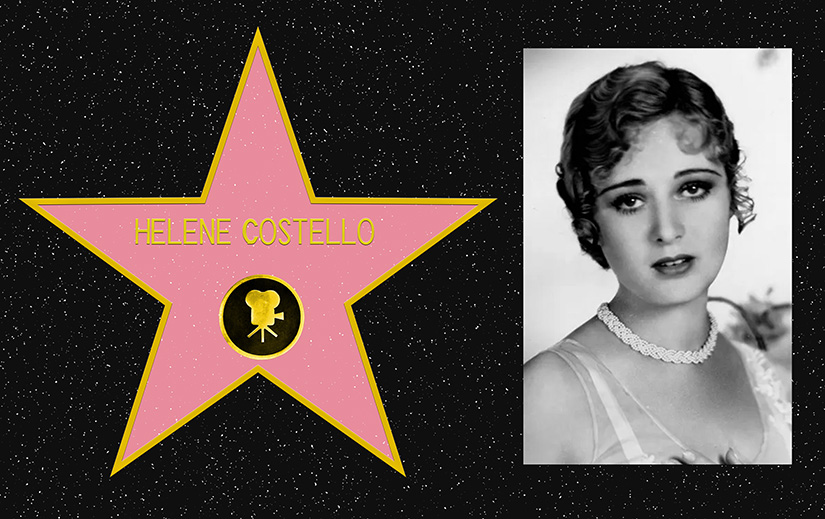
Helene Costello (1500 Vine Street) is another casualty of the jump from silent films to talkies. She’s buried in an unmarked grave somewhere in Calvary Cemetery, one of the oldest cemeteries in Los Angeles. And she wasn’t related to Lou Costello, but he claimed he changed his last name to Costello to honor her.
Today’s fake poster is based on one from a different story of New York.
More saccharine than I expected, but far less saccharine than you’d think from the trailer’s use of Ooh La La by The Faces. Strong performances all around, but it never quite pulled me in.
I’m way behind in my fake poster for real movie based on real poster for other movie project, so I’m starting to lean in to the simpler ones. At this rate my last one will be a remake of the advance poster for Ant-Man.
Deliberate, but not tedious; every frame is there for a reason. I’m sad that most people will watch this on Netflix, because it looks amazing on a real movie screen.
I went for an easy poster today, based on one from a recent movie that has surprising parallels to this movie.